A property management dashboard for landlords · Startup
RentChirp Portal - Startup

RentChirp is a Bay Area startup that helps people find affordable apartments through data-driven property listings. During my internship, I designed their property management portal, a dashboard giving busy property managers an easy way to track every unit they manage, from first listing to ongoing promotions.
ROLE
UI/UX Designer
TIMELINE
2 Weeks
The Problem
User pain point
I talked with three property managers who were juggling spreadsheets and email threads just to track vacancies. The clearest pattern: they did not need more data, they needed less friction reaching the three or four numbers they checked every morning.
Business impact
RentChirp's co-founders were direct about what they needed: something aesthetically pleasing, clean, and easy to navigate. As a startup competing on the quality of its listings data, a clunky management portal would undercut the polished experience they wanted to offer.
THE CONSTRAINTS
This was a 2.5 week internship project, a tight timeline to go from wireframes to a finished, cohesive dashboard covering property details, amenities, and promotions.
Key Insights from Discovery
This was an internship, and I didn't have property managers to talk to about what their day actually looked like. Rather than guess, I looked at how Zillow and Apartments.com, two of the biggest names renters recognize, handle the property manager side of their platforms. Both are consumer-facing search tools most people know, but both also run a separate, dedicated portal for the landlords and managers actually listing those properties. Studying their patterns was the closest thing I had to real user input.
Zillow Rental Manager
Zillow's landlord product is a full dashboard, not just a listing form. It's available on web and as its own iOS and Android app, and it centers on the things that stress a manager out: listings, applications, screening, rent collection, and tenant messaging, all reachable from one place.
Apartments.com Rental Manager
Apartments.com's Rental Tools Dashboard takes a more customizable approach, landlords can drag, drop, resize, and remove widgets to fit their own workflow. It also has a mobile app, and the dashboard is built to condense listings, payments, and performance metrics into one view instead of forcing managers through a maze of separate pages.
The Process & Constraints
One of RentChirp's business goals was to make things easy and simple for property managers. Knowing that managers have a wide variety of units in the database, I gave them the option to view properties in a list or thumbnail grid depending on what suited their browsing style.
The Final Solution
Dashboard
Managers search by address and switch between list and thumbnail views.
Each property card links directly into its detail flow for quick edits.
Property detail
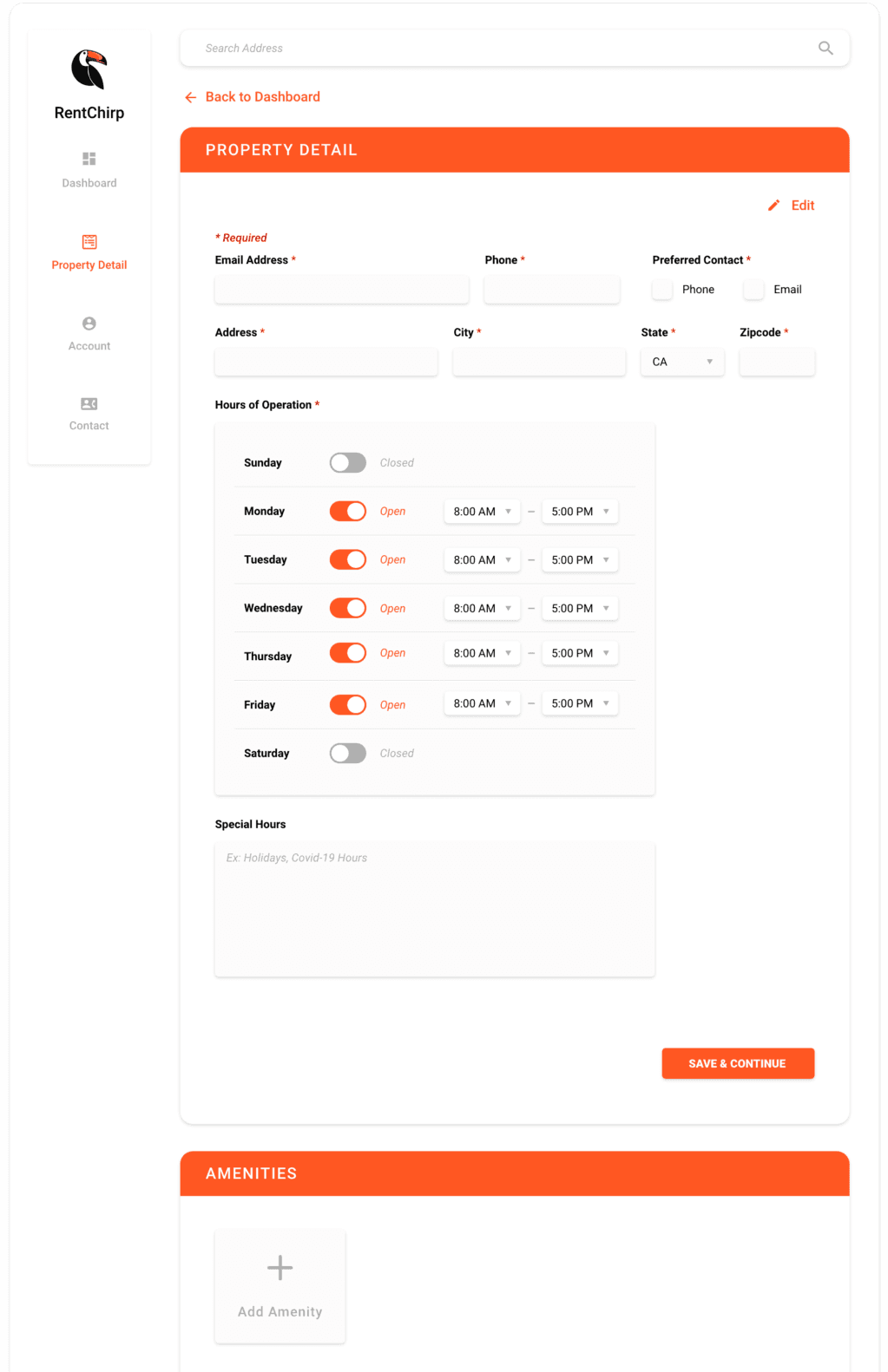
Required fields are clearly marked, and hours of operation are configurable per day with toggles for open/closed.
A Special Hours field lets managers note holiday or temporary schedule changes without disrupting the standard weekly hours.
Amenities and promotions
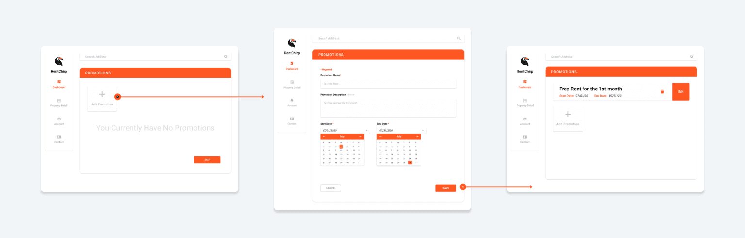
Amenities and Promotions were designed to feel consistent with each other, same layout pattern, same add/edit interaction, so managers only had to learn one mental model for both.
Promotions let managers set a name, description, and a start and end date, so time-limited offers like "free rent for the first month" are easy to schedule and track.